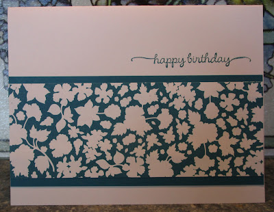
Last week I mentioned to some friends that I really need to go back to some of the partial packages of designer paper that I have from Stampin' Up! and get them used up. SU seems to be coming out with more such beautiful papers faster than I can use them up! Some of the papers are designs that I have been hoarding.....hating to cut into them. Other are papers that I'm not quite sure what to do with them although I may find some ideas on Pinterest.
Here are half of the cards that I made over the weekend using up one of the patterns from the long retired Twitterpated paper pack. The cards will appear to be from a One Sheet Wonder format, but they really weren't and I'm not sure that they all came from a single sheet.
#1
The color in the designer paper is Island Indigo. I couldn't find any in my paper supplies so I used Not Quite Navy. It's OK but I wasn't real happy with it.
#2
One more card using the Night of Navy.
#3
I didn't give up. I went back through some of the card stock that had multiple colors and discovered two full sheets of it and a couple smaller pieces in the 2011-2013 In Color package. The rest of the cards for today and tomorrow made me much happier.
#4
Instead of a vertical card, I turned this one into a horizontal format. The butterflies were die cut from a set of Spellbinders butterfly dies.
#5
My least favorite of the cards. I need to do something with the white areas on the left and right side. Maybe a couple of small butterflies would fill in the emptiness.
#6
Tomorrow I will show you the other six that I made with this same designer paper. If only this had made a dent in the sheets I need to use! I'll keep trying and have two more pieces of designer paper on my craft table to do some more. They'll probably all look a lot like these so I won't be posting all of them but maybe just a card or two with the different dp designs.
Thank you for coming by today!


2 comments:
I applaud you for attempting to make a dent in your patterned paper, Vicki! LOL! I could never make a dent in mine, either. Your cards are all so pretty - great job!
What a great group of cards. I like your idea about adding a couple of small butterflies to the white areas on one of the cards. I always struggle with white space, too. I just don't feel comfortable leaving lots of blank areas on my cards, and yet I really like the CAS cards that others create. Go figure!
Post a Comment